Mamma Money: Redesigning cross-border transfers for migrant workers in Southern Africa
+25%
Successful registrations after onboarding redesign
−40%
Drop-off during KYC verification
↑ NPS
Among mobile-first users post-launch
Role
Lead Product Designer
Duration
1 year
Scope
Research · IA · UI · Testing
Gallery
The problem
Mamma Money helps migrant workers in South Africa send money home to Zimbabwe, Malawi, and Mozambique. The product was growing — but almost entirely through agent networks. Self-service onboarding was broken, and users were dropping out before completing a single transfer.
I was brought in to own the full design process: understand why people were leaving, and redesign the experience from registration through to transfer completion.
“The app had strong fundamentals. The problem wasn't trust in the product — it was that the interface made people feel like they were doing something wrong.”
What I found in research
I ran ethnographic interviews and field research across three sending corridors, combined with moderated usability testing with first-time users. A few things became clear quickly:
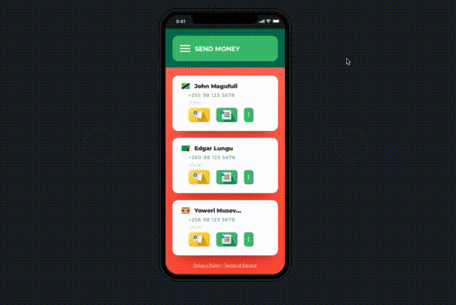
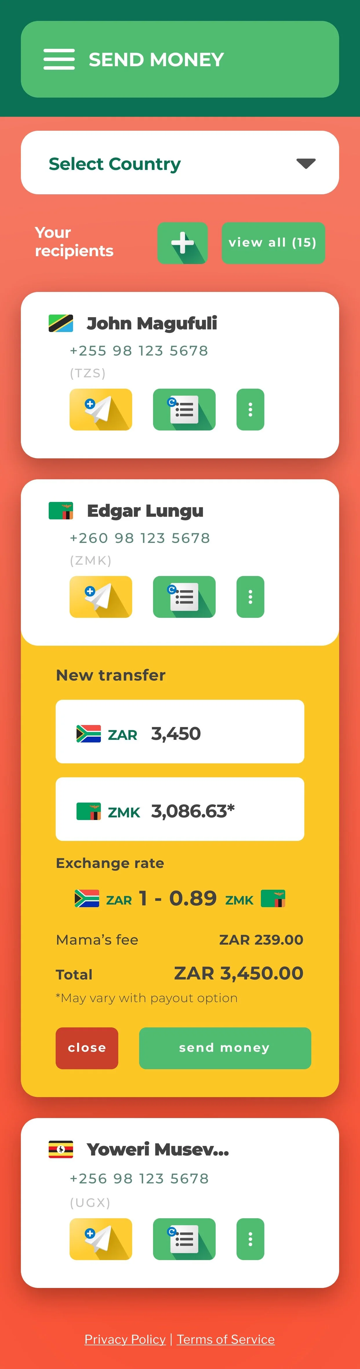
The KYC flow was the biggest culprit. It was presented as a single wall of steps with no indication of progress, no explanation of why documents were needed, and error states that gave users no path forward. For users with lower English literacy or unfamiliar with formal ID verification, it felt opaque and untrustworthy.
Drop-off data confirmed this. The biggest funnel leak wasn't at the payment step — it was at document upload, where users simply abandoned the process entirely.
Key decisions I made
Progressive KYC
I broke a monolithic verification form into four smaller, named stages. Each step explained its purpose in plain language and used real-time validation to prevent silent failures. This was a deliberate push against the compliance team's initial preference for a single form — I had to make the case with usability data that the drop-off cost outweighed the simplicity of a single-page approach.
Simplified navigation IA
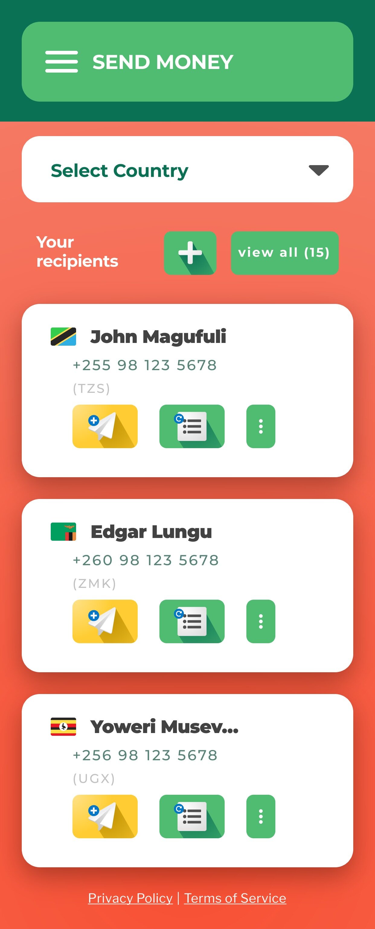
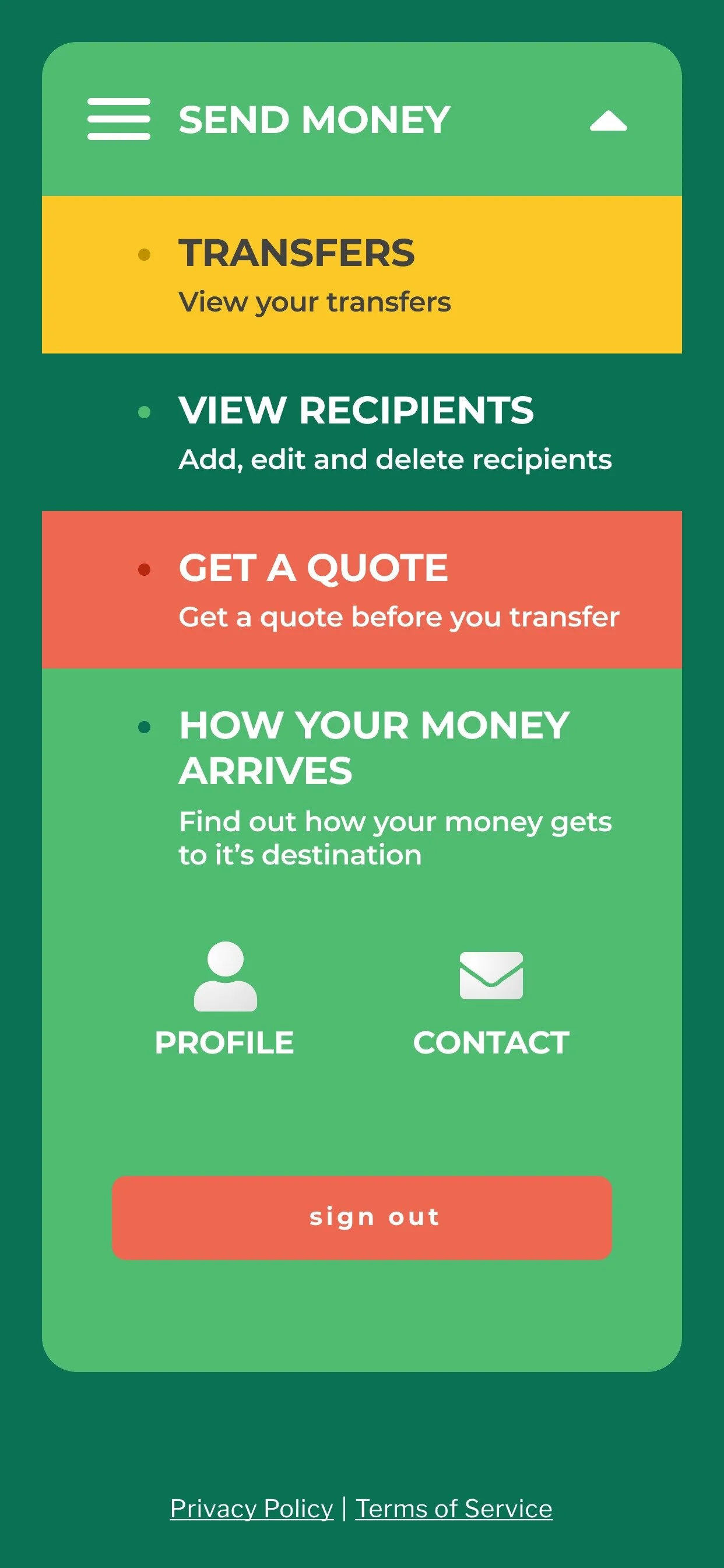
The original app had 11 navigable states. I reduced core actions to three: Send, Track, History. Everything else became contextual. This was validated in testing — users completed transfers 30% faster in prototype sessions without prompting.
Designed for low-bandwidth first
I partnered closely with engineering to ensure every screen worked on 2G connections with limited data. This meant stripping out heavy assets, testing on real devices in degraded network conditions, and choosing iconography over imagery throughout the UI.
The outcome
A/B testing of the redesigned onboarding flow showed a 25% lift in completed registrations and a 40% reduction in KYC drop-offs. Mobile-first NPS improved meaningfully in the months following launch.
Beyond the metrics, the research framework I set up — monthly usability sessions with both new and returning users — became a permanent part of Mamma Money's product rhythm. It was the first time the team had a structured feedback loop running continuously.
Best Fintech Startup in Southern Africa — awarded during the period of this redesign
What I'd do differently
I'd push harder for multilingual content earlier. We identified language as a barrier in research but treated it as a phase two problem. In retrospect, even basic localisation of the KYC microcopy into Shona and Chichewa would have moved the numbers further — and I should have made that case more forcefully from the start.